Work
Chabashila
UX, Ed Tech, Web Design
Creating a modern navigational design for a language academy
June 2022
Role: Product Designer [Solo Project]
Responsibilities: User research, Interaction Design, User Interface, Project Management
Tools: Figma, Framer, Coda
Duration: 6 weeks [May-June, 2022]
Client: Amy Kajiyama, CEO of Chabashila
Industry: Education/Technology
Challenge
Chabashila is a successful Ed Tech business headquartered in Tokyo, Japan with students all over the world. Started out as an independent Japanese language tutor in the great Tokyo area more than a decade ago, the founder and CEO Amy Kajiyama acquired a significant amount of business leads through words of mouth in early days due to her industry reputation as an educator.
The business expanded exponentially during pandemic from 2020 when many people started to invest more time in online learning, Amy hopes to officially setup an online platform to generate more leads and manage the channels more smoothly while tapping into the B2B market for corporate clients.
Objectives
- To create a website with a function for users to book an introductory lesson
- To reorganize website information architecture for users to provide more confidence before booking
- To direct web traffic based on the client types: individual and corporates
Design Process
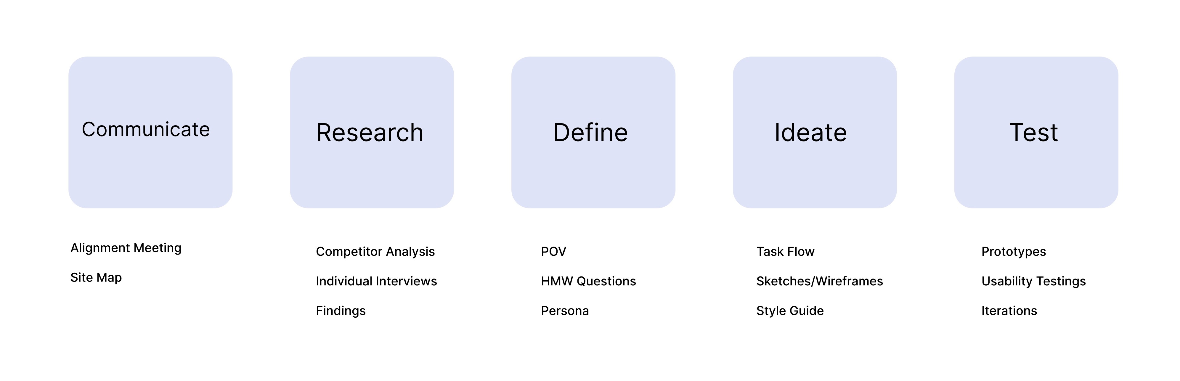
0. Communicate
Alignment meeting with the client- the founder of Chabashila with a site map of the current design
I met with the CEO of the business Amy Kajiyama to establish business and design goals by understanding her expectations, challenges, and priorities for the project. Also, it was essential to get the details on the day-to-day business operations. She stated that the ultimate goal of the website is to get users to book the free introductory session.

We also examined the site map I created for the existing website and came up with some options to regroup, remove, and combine some of the items. For example, the “Online Lesson” and “Face-to-Face Lesson” could be grouped under “Lessons” when the pages for “Blog” and “Photos” can go under “About”. After the discussion, Amy decided to remove the internal-use pages “For students” and “For teachers” immediately as well as the career page.
1. Research
Secondary Research: Competitive Analysis
Competitor Analysis I gathered a list of potential competitors that provide both online and offline Japanese language learning options, and named the top three direct competitor and two indirect competitors.
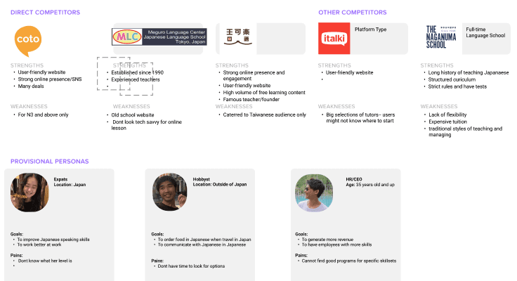
After carefully analyzing the web designs, information architecture, and the CTA of booking process, I noticed that all platforms, whether is online or offline, they are aiming for the booking of trial lessons. More findings are listed as below:
Secondary Research Findings
The demand for learning Japanese has always been high as Japan is still ranked one of the top travel places int he world and there is also market for anime lovers
Chabashila has a steady flow of customers mainly through words of mouth where as other platforms get leads from online marketing besides words of mouth as the competitors are very active on social media as well.
Online lessons became popular since Covid-19 as people also have more time to invest in new skills
An user-friendly website became even more important as it is now the “lobby” of the business. It should a layout where users can find what they need to know in order to be converted as a new student.
People who are currently living in Japan have more motivations to improve their Japanese language skills.
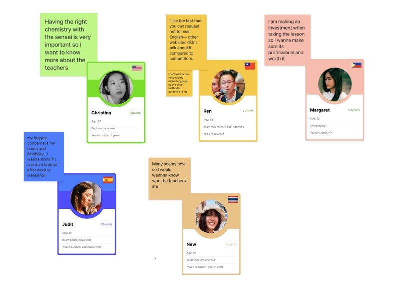
Primary Research: Individual Interviews
To further understand how users explore the website before making the decision to book, I conducted user interviews with 3 Japanese learner (B2C users) and 1 business manager (B2B user) to understand the user behaviors, needs, goals in order to phrase questions to get relevant data.
[insert image of Affinity map for the interview results]
Primary Research Findings
For the B2C users, all of them have the main need of wanting to speak better Japanese. Improving conversation skills is the most important to them.
B2C users wondered if there is a trial lesson and how to book it. Currently, users cannot find the info about this on the website unless they send the email to ask about it.
For the B2C users who are no longer beginner — the intermediate learners, it gets harder for them to define their level of proficiency since their learning of Japanese language have been on and off. A level check is needed.
The users are interested in knowing more about the textbooks and materials.
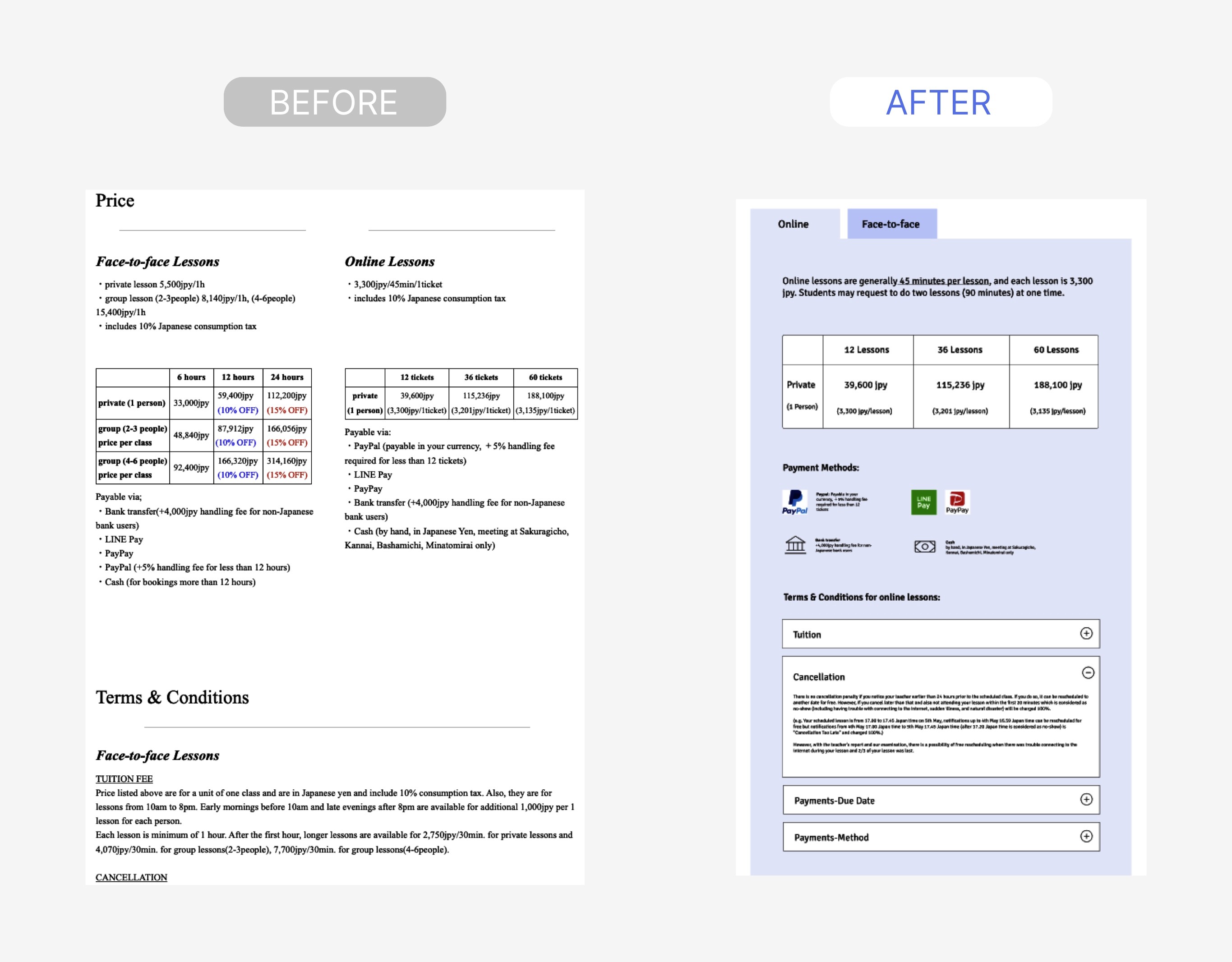
The users find the pricing confusing since they have to go back and forth between ONLINE LESSON page and PRICING page. The charts in the pricing page is also hard for them to understand, the the top left one saying 6 hours.
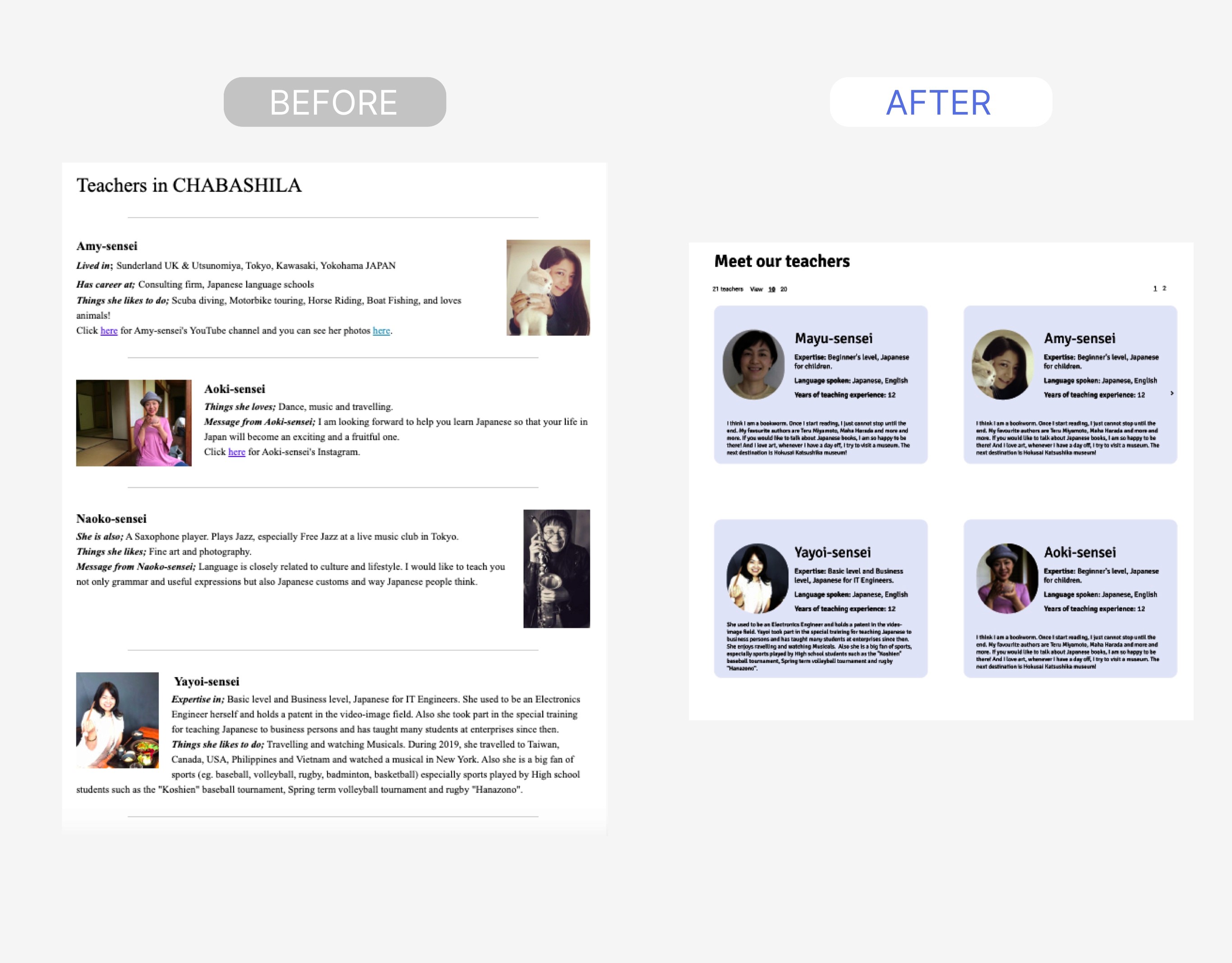
All of them find the teacher profiles too casual, and hope to know more about teachers education background and expertises.
2. Define
Based on the findings, I came up with a POV and research questions to design around.
POV : A talented expat working and living in Tokyo has problem communicating effectively at work due to the lack of Japanese language skills, but she/he does not know where she/he fits in terms of the level and does not know where to start to improve.
How might we help users to check their Japanese proficiency level before booking a lesson?
How might we help users find the info on pricing and text books easily?
How might we help people to increase their trust in instructors/company before booking?
How might we create more relevant course pages?
How might we improve the guidance for people from initial homepage visit to first lesson?
How might we help the users to understand the booking process— an overview of steps
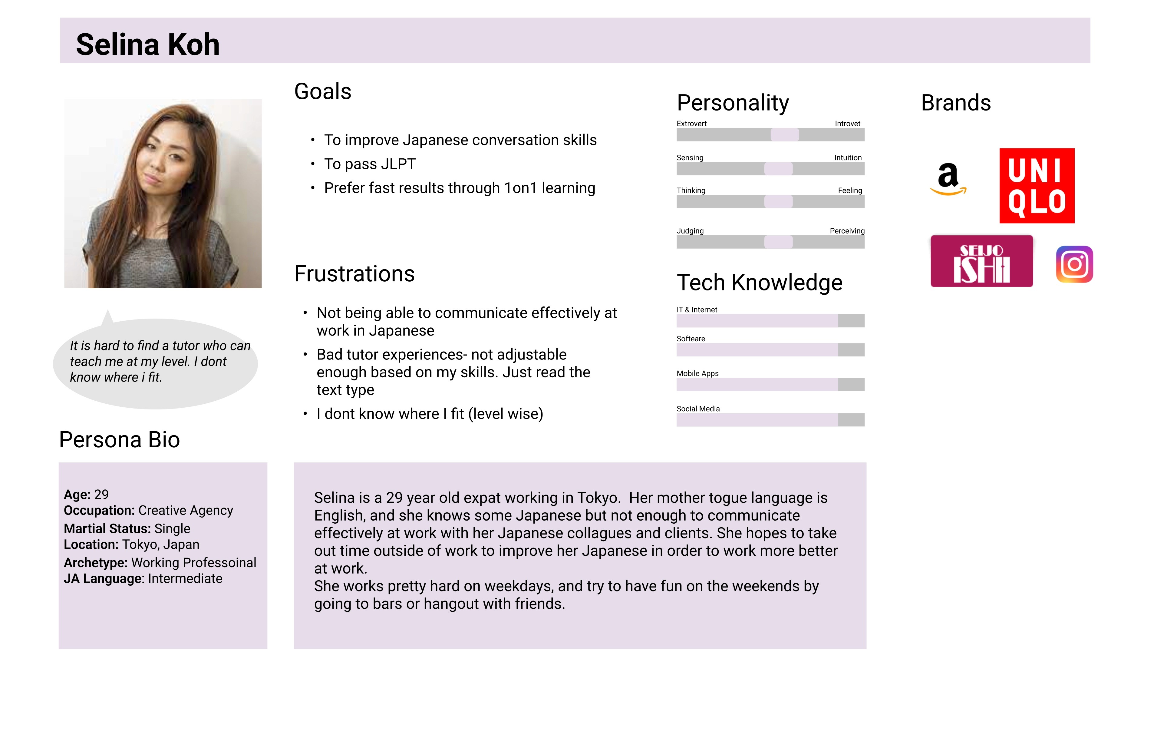
Persona
3. Ideate
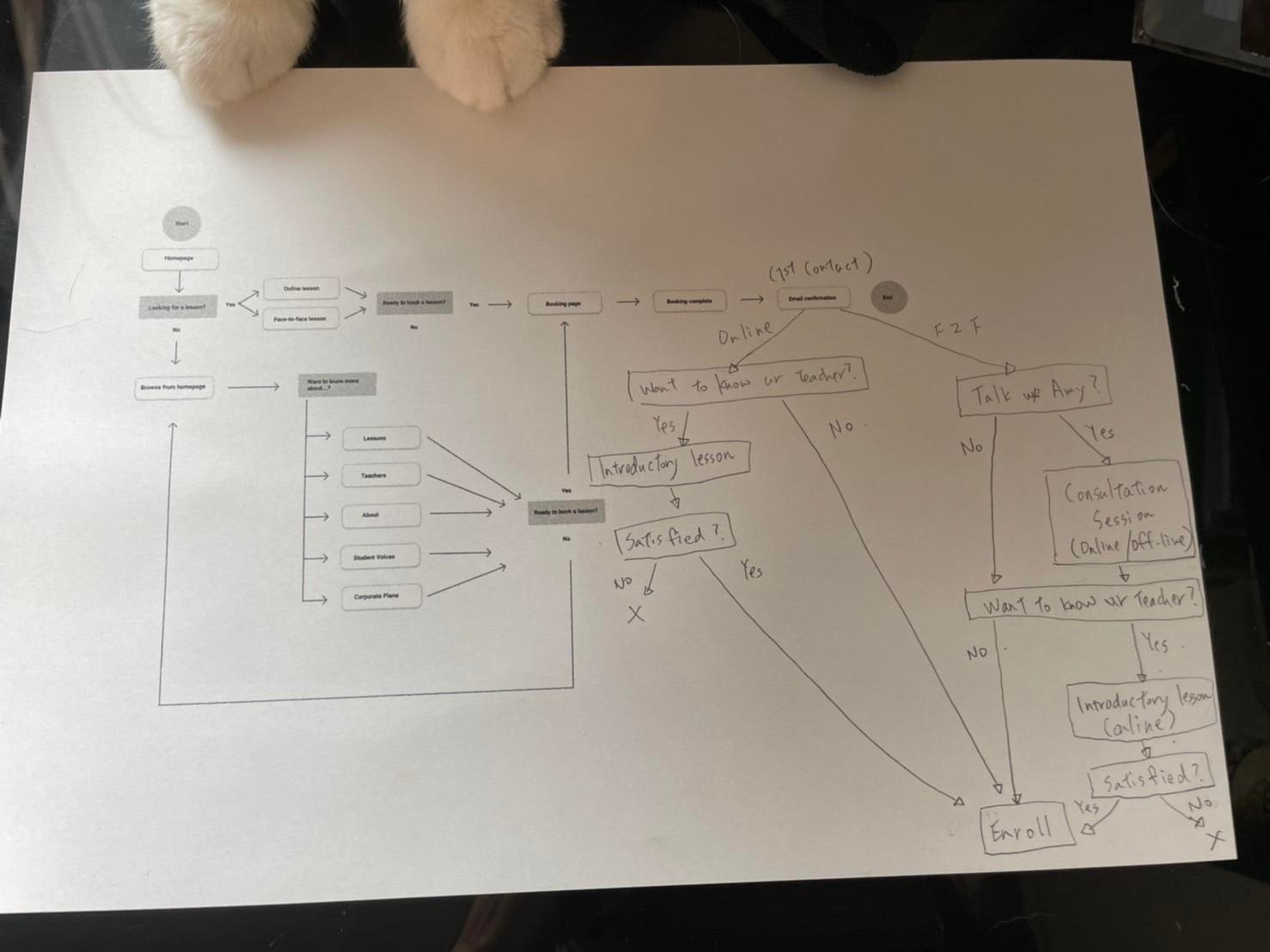
A task flow chart was created based on site map and the findings from the research as below:
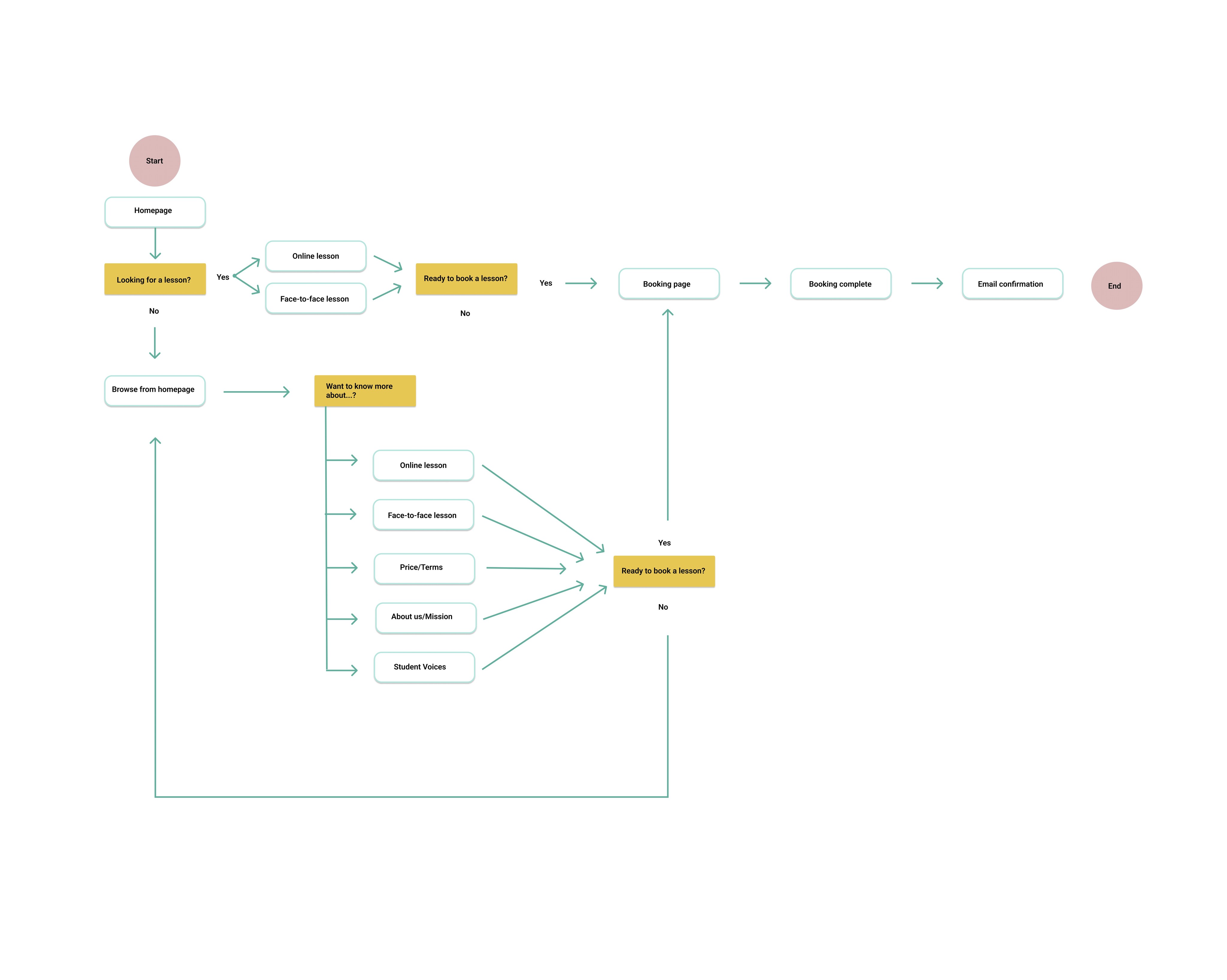
The client and her cat also contributed by making task flow together.
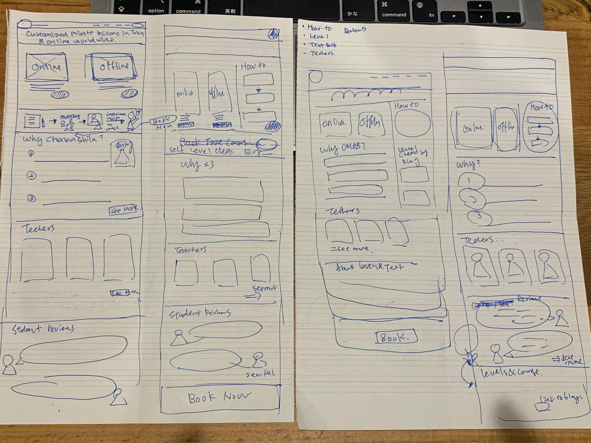
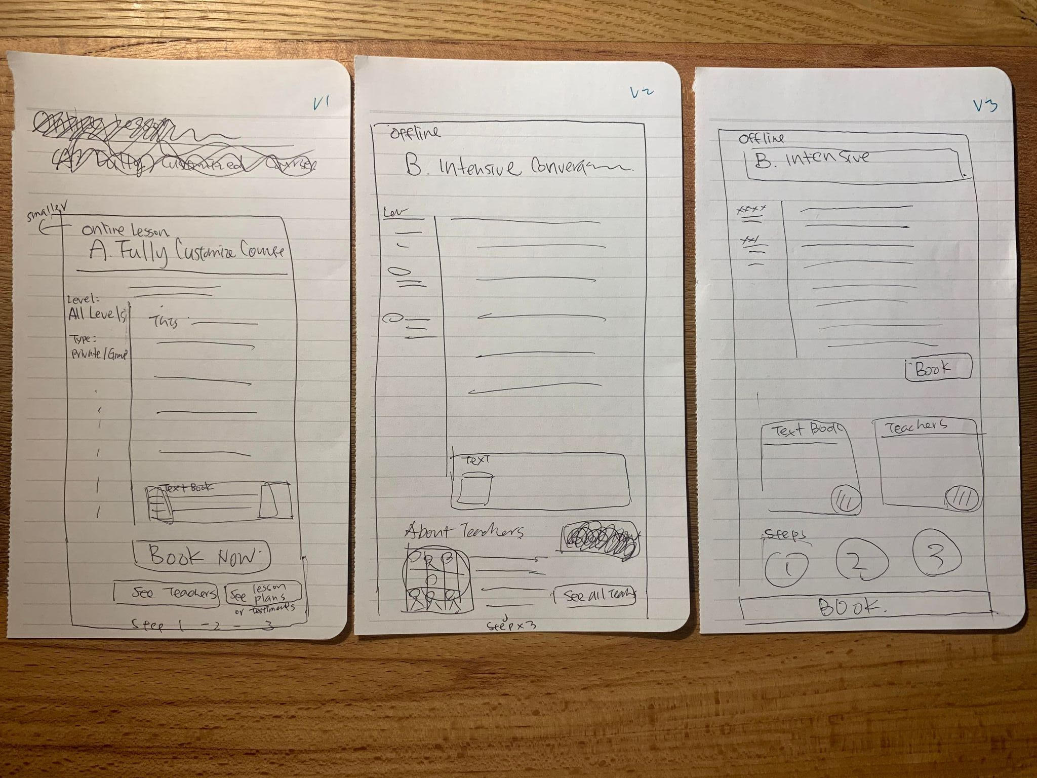
Sketches
With a task flow in place, I began sketching by doing rounds of core design thinking method - crazy 8. (What is Crazy 8: It is a fast sketching exercise that challenges people to sketch eight distinct ideas in eight minutes.)
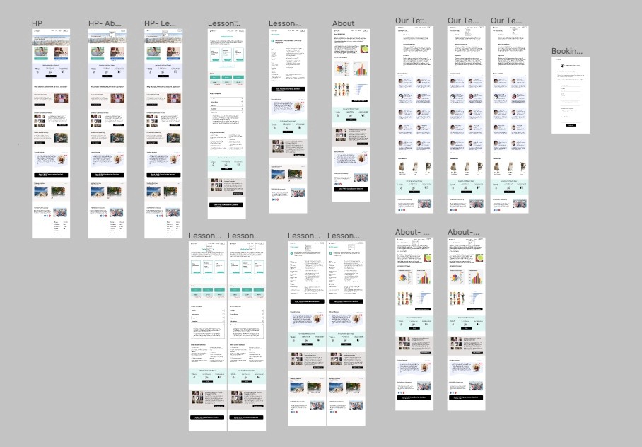
Clickable Prototypes
After sketching, I translated the flows into clickable prototypes on Figma with designs of homepage with a navigation bar, course type page, course detail page, teacher page, about page, and booking page.
4. Prototype & Test
Usability testing was conducted with 5 participants remotely using the clickable prototypes. The goal was to identify why users engage or disengage with the website as well as to explore how to increase users’ overall satisfaction with the website.
Four out of the five participants were non-Japanese native speakers and expats living in Japan who have motivation to improve Japanese language skills for their work. One participant is a working professional in Thailand who has a strong interests in Japanese language and culture. All of their Japanese language skill levels vary from beginner to intermediate.
During the usability testing interviews, participants were asked to navigate the pages freely while thinking out loud. Also, they were given a task of “booking a trial lesson” for me to observe the user journey. Lastly, the participants described the overall experiences of using the website.
Usability Test Findings
Participants experienced difficulties navigating with just three tabs as they don’t know what to expect for each drop down and couldn’t find what they were looking for unless they click the drop down, such as pricing.
Participants showed a lot of interests in knowing “pricing” when first landing on the website, and with the prototype design, “pricing” page is hidden under the “Lesson” tab inside the navigation bar.
Most participants claimed that they did not click on the “Online Lesson” and “In-person Lessons” buttons on the front page because they didn’t know those two were buttons.
Teacher profiles are important when it comes to booking tutoring sessions, stated by the participants. All of the participants were satisfied with the current teacher page design where it highlights the expertise, languages spoken, and years of teaching experiences so they can know about each teacher at a glance.
Participants find texts on the website content lengthy and confusing, for example the wordings such as “Tickets” for lessons.
Participants showed interested in knowing more about their current language levels by reading the blogs.
Iteration
Navigation bar was originally simplified by having only three tabs with drop down menus, however, I iterated and created more tabs on display so the users can find what they need on the first glance without having to guess what’s under the tab for the drop down menu.
Pricing page was added as an individual page on the first tier of the navigation bar since this is one of the first things users interested in knowing when landing on the website.
Wording for buttons for “Online Lessons” was changed ”to “See Online Courses”, adding an action word while I adjusted the opacity to make the photos less distracting.
Level Check page was added in the navigation bar to help users get to know where they are in terms of language skills before booking.
Output
Price charts available with one click for both “online lessons” and “face-to-face” on the same page.
Teacher profiles displayed in biography card form with key information highlighted to see the quick facts about a teacher.
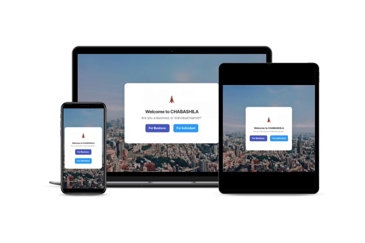
A welcome page to divert traffic for individual students and corporate clients.
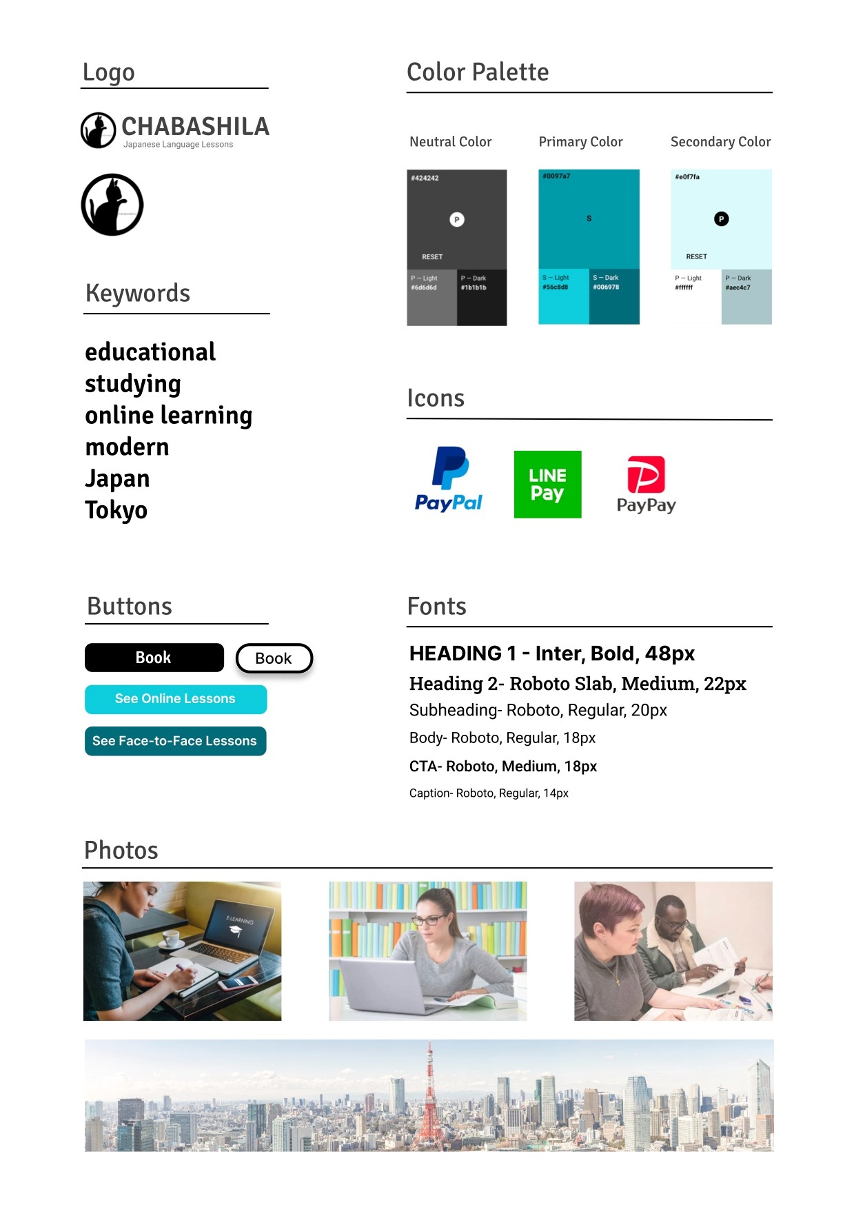
Rebranding with new style guide
Lesson Learned
Speak their language: Some wordings mean different things for internal members and users, for example, the company used “Ticket” to in the pricing page for the course packages, but this was confusing for all users. This is where the UX designers come in and help the clients and users to communicate in the same language.
Money talks: Every service/product is an investment for the users, so information on pricing is often one of the first things users look for. As UX designers, we should make sure that this sensitive information is easy enough to find in order to show that this business is ethical and transparent.